Have you ever been completely drawn to a brand at first sight? That magnetic pull is often not by chance; it’s by design, specifically through the strategic use of color. Colors aren’t just part of your brand’s style; they are the silent ambassadors of your brand, speaking volumes before a word is even read. Understanding the transformative power of color can unlock the potential of your brand’s palette, helping to establish a stronger connection with your audience and distinguish your brand in the marketplace.
Why Colors Matter More Than You Think
Colors influence how customers perceive your brand and interact with it. They go beyond aesthetics, reaching deep into our subconscious to evoke specific feelings and actions. According to the study “Impact of Color on Marketing” by Satyendra Singh, up to 90% of judgments made about products can be based on color alone, and those judgements are made within the first 90 seconds!
You have less than two minutes to get your brand’s culture across;
what message are you sending?
Color palettes can influence perceptions that aren’t obvious, such as the taste of food, the perceived weight of a package, or the attractiveness of a website. Different colors evoke different feelings and associations. For example, blue is often associated with trust, stability, and reliability, making it a favored choice in corporate and tech industries. Red, known for its intensity, can create feelings of excitement or urgency, which is why it’s commonly used in clearance sales and call-to-action buttons.
The Psychological Impact of Colors
Colors have the power to affect our mood and behavior, a concept explored in detail by researchers like Andrew J. Elliot and Markus A. Maier. Their work in the Annual Review of Psychology explains how colors can influence psychological functioning, affecting everything from brand perception to buying behavior. For instance, green often evokes a sense of tranquility and health, while black can evoke feelings of sophistication and power. That said…
The Cultural Significance of Colors
Colors carry different meanings in different cultures, which is an essential consideration for brands operating in global markets. For instance, white is traditionally worn at weddings in many Western cultures and is associated with purity and peace. However, in some Eastern cultures, white is the color of mourning. Similarly, while green is often used in the Western world to denote health, nature, and vitality, it can represent sickness in other cultures.
Before finalizing your brand’s color palette, it’s crucial to consider the cultural context of your target audience to avoid misinterpretations and ensure that your brand’s colors resonate well globally.
Colors and Brand Identity
A consistent color palette is vital for building a strong brand identity. It increases brand recognition by making it easy for your audience to visually identify your brand across all media. A study by the University of Loyola, Maryland found that color increases brand recognition by up to 80%. This is why companies like Coca-Cola with its iconic red and white palette, and Tiffany & Co. with its distinctive blue, invest heavily in protecting their color schemes as part of their brand identity. The wonderful part is, you don’t need to have big brand’s budget to leverage this!
Color increases brand recognition by up to 80%
Choosing the Right Color Palette
Selecting the right color palette goes beyond personal preference. It should be a strategic decision that considers the psychological connotations, cultural implications, and your overall brand strategy and values. Here are a few steps to guide you in choosing the right colors for your brand:
- Understand your brand’s core values and personality: What are the key messages you want to communicate through your brand? Is your brand playful and fun, or serious and professional? The colors you choose should align with these traits. (This is why I focus so heavily on your archetypes!)
- Consider your audience: Who are your target customers? What are their preferences, and what colors are they likely to be drawn to? Or, what colors will they have a negative reaction to? This understanding can significantly influence your color choices.
- Analyze the competition: What colors do your competitors use? While it’s important to understand industry trends, you’ll also want to choose colors that set you apart from the competition. For example, for a past client in the acupuncture/holistic medicine space, we very specifically avoided muted blues and tans. While those colors make sense for the industry’s desired emotional evocation, they didn’t make sense for her and the energy she brings forth. She wanted to appeal to those looking for something different, and in that way, we were able to help her brand evoke similar emotions while staying true to her values.
Consistency is Key
Once you’ve chosen your brand colors, maintaining consistency across all your branding efforts is crucial. This consistency should extend beyond digital assets to physical ones like forms, business cards, and merchandise. Consistent use of color strengthens brand recognition and enhances the coherence of your brand’s visual narrative.

Your Invitation to Transform
Remember, every color tells a story. What story do you want your brand to tell?
Let’s craft a palette that not only looks good but feels right and truly represents what your brand stands for.
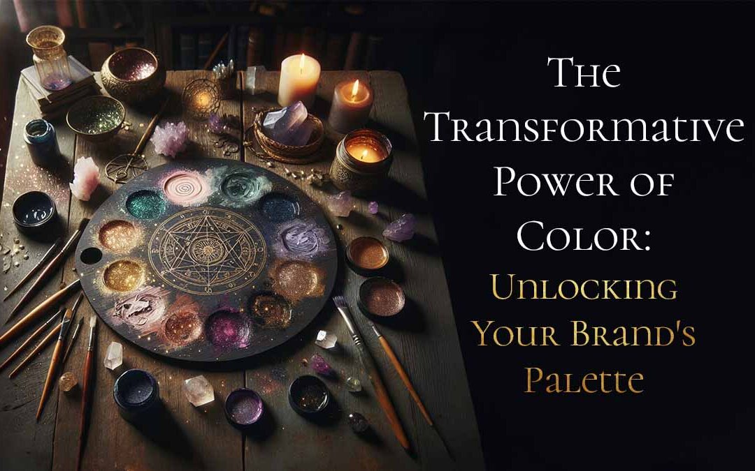
Introducing Color Alchemy
That’s where Color Alchemy comes into play. This innovative service isn’t just about creating beautiful color schemes; it’s about crafting a palette that resonates with your brand’s inner essence and effectively communicates your core values to your audience.
Archetype Assessment: We start by discovering the core archetypes that represent your brand’s spirit.
Deep Dive Call: A focused conversation helps align these insights with your business goals.
Custom Color Palette: You receive a unique palette that visually represents your brand’s voice and values.
Color Alchemy in Action: A Step-by-Step Guide
Let’s break down the steps involved in Color Alchemy to give you a clearer picture of how we transform your brand:
Initial Consultation: Here, we discuss your vision, values, target audience, and what you aspire to communicate through your brand. This sets the foundation for a color scheme that truly matches your brand’s personality.
Color Psychology Mapping: Based on the outcomes of our archetype assessment, we explore various color psychologies that align with your brand’s core values and desired audience reaction.
Palette Creation: We then develop a bespoke color palette, ensuring versatility and coherence across all mediums.
Mood Board Development: Alongside your color palette, you receive a mood board that helps visualize how these colors translate into real-world applications and acts as a reference for future visual branding.
Implementation Guide: The final step is your Color Alchemy Recipe PDF. This guide includes practical applications, Hex codes, RGB values, and CMYK codes for print and digital use, ensuring you can apply your new color story consistently across all branding materials. It’s also great to hand to any designer you work with in the future for easy brand clarity!

What's Next?
If you’re ready to dive deeper into the world of colors and see how the right palette can transform your brand, visit Color Alchemy. Here, you’ll find more details on getting started, and you can book a session directly through the site.
Ready to transform your brand with Color Alchemy? Let’s make your visual identity unforgettable! 🌈✨
Wishing for your every happiness,

